A good effort for a first timer.
")
Here are my more detailed comments:
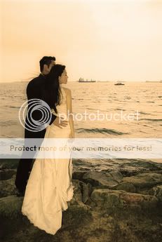
1st shot --
a) The colour's quite weird. It's more of a colour cast to me than sepia.
b) Part of the bride's face can be seen from her side profile, that's ok. But the groom...!!! His face has been hidden which cuts off the whole meaning of the pic. Is he there as an extra or do you want to show the closeness of the couple? I think it's the latter. Then you'd do want to show his face too.
c) The burnt highlight from the sky is distracting.
d) It'd be good to show what the couple is looking at. Otherwise, this shot looks like the couples are simply static 2 people objects placed to the side of the pic.
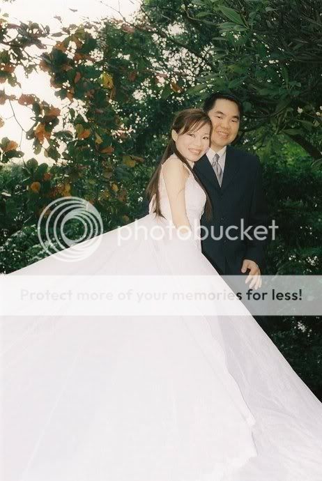
2nd shot --
a) Nice expressions from the couple. Unfortunately, the gown of the bride has taken up too much of the pic and I feel the remaining parts seem to be vying space in the pic. Sort of disproportionate in terms of composition.
b) The bride's right hand seems to disappear in her gown because her white gloves blend into the white gown, like she's putting it in a side pocket or chopped off! Not flattering at all. A simple way out could have been to ask her to place it on her husband's chest. There should be good contrast then between the white and black.
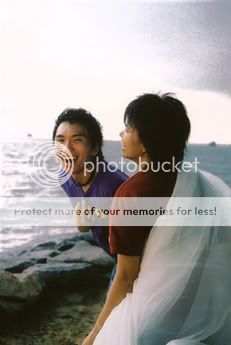
3rd shot --
Not much to comment here as it looks like a casual grab shot than anything intentional. Nice candid expression on the gentleman in blue. Otherwise, as in previous shot, the burnt out sky is distracting.
Guess giving genuine advice and opinions in CS can be a dangerous thing as there's a likelihood of flaming.
So here's the disclaimer: I'd say I've given my frank opinion as a viewer and a photographer rather than pretend to be diplomatic. Others' views may differ. That's ok.
It's a good (or brave!) start nevertheless. Everyone has to start from somewhere....