Various landscape photos


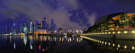
Dug up a very old Nov 2008 photo when someone reminded me of the vertical marathon. Didn't know whether to post here or P&P :bsmilie:

This was back in the days when I shot everything automode and didn't know anything about photography. Think I just got the G1 not long ago. I still think it's quite good leh... no? :sticktong

#102 - 16 Nov 2008 Swissotel VM.
P1000806.JPG
 

#103 - Bishan Sunrise 3 Jun 2010.
4668963811_2e04a9ffb5_b.jpg

Yesterday morning was magical. I tried to get it again this morning but it's just plain ole sunrise again. Taken handheld from my room. Opened aperture as big as possible and pushed down one stop exposure to bump up shutter speed as much as possible.
ISO200
f3.5
1/125sec
Exposure: -1 stop
Time: 6:49am
Date: 3 June 2010

C&C welcomed.
 

Last edited:
#104 - another Bishan Sunrise. A bit too saturated after I played with the S curves but even after I try desat a bit (without changing the pix too much) is still quite saturated. I wasn't even sure if I was going to post this up; there isn't anything outstanding. Shapeless shapes of shadows, non-outstanding cloud structures, light in sky was pretty straight (except for the colour) and I couldn't convert to a B&W either without manipulating the blue till sky was dark otherwise it was just plain uninteresting :dunno:
4671583958_9c8d516525_b.jpg


Lemme know if you don't like this picture also. :angel:
 

#105 - CBD with sun spotlight on Maybank/UOB building
4674523951_fa4a8db7c6_b.jpg
 

Last edited:
#107 - bro r00ki3 caught in action
DSC_3330.jpg
 

why does #105 look so fakeish at the top? i see a fair bit of haloing on the buildings.......... which seems to suggest improperly done exposure blending. but could be anything - improper burn/dodge would result in that too, as with excessive highlight recovery.

#106 is a nice idea, well done, well executed. i do wish that the reflections did not blend with the foreground though, was this the highest possible that you could have gone?

nice warm light in #107, but apart from that i can't really see any merits in the photograph. perhaps as a keepsake for memory with shooting with friends...?

#103 works a lot better than #104, because there is a lot more "harmony" in the photograph. your elements do not clash with each other, and that huge slashing gentle cloud at the top helps to balance out the empty space above the buildings and the fire below. i would personally take the trouble to darken the lighter parts below though.

#104 really has too much going on, with various focal points that make the eyes dance around, not a good result. i would probably have tried something longer here to see if getting closer to any part of the photo in particular would help, e.g. left side of photo has those two smaller buildings (or rather, further away, possibly) with those clouds there and the colour. wider is not always better.

#102 - no comment. human subjects not my favourite here, what i wanted to ask though, is why is this under a thread called "various landscape photos"? :bsmilie:
 

more detailed comments for page 7, since have not visited in a long time:

do take note of your exposure blending, especially #99, the foreground seems way too bright for me.

i understand that this could be a result of the light, but it does seem a bit out of sorts, so even if the foreground was indeed relatively brighter in 0ev, i would take the trouble to balance exposure out.

there is vignetting around the swimming sign of sorts - looks like a botched dodge/burn result. try using layers --> screen, and then erasing with soft brush properly, should yield better result. then adjust opacity of layer to taste.

WB on #96 is leaning too much on the green/blue side for me. as much as there is more leeway in night photos/pre-dawn, etc.. that color palette doesn't seem very pleasing - i'm sure there's something better and achieveable with careful adjustment.

i find that a cross crop of #93b excluding all the other buildings behind/around ilumna would be better. just the patterns alone, or the patterns with that logo would be great.
 

why does #105 look so fakeish at the top? i see a fair bit of haloing on the buildings.......... which seems to suggest improperly done exposure blending. but could be anything - improper burn/dodge would result in that too, as with excessive highlight recovery.

Haha. I thought nobody will notice the halo! Thanks for noticing!! It was a result of my laziness when I did the 2nd version of the pix. I was trying to merge back a more original version of the sky which had more details after NNB's comment in another thread, and I did it by just selecting the general area using Quick Selection Tool, Refined Edge (with too big a value), and cut out sky and by the time I realized it, I had saved a version with Flattened Image (call this a lesson learnt) and couldn't go back to redo.

This is a recovered pix from a slow moving tripod plate (another lesson learnt)

#106 is a nice idea, well done, well executed. i do wish that the reflections did not blend with the foreground though, was this the highest possible that you could have gone?

May try this again; thanks suggestion!

nice warm light in #107, but apart from that i can't really see any merits in the photograph. perhaps as a keepsake for memory with shooting with friends...?
Was the nice warm light... and yeah, just waiting for friend to post his version of photos up here too :-p

#103 works a lot better than #104, because there is a lot more "harmony" in the photograph. your elements do not clash with each other, and that huge slashing gentle cloud at the top helps to balance out the empty space above the buildings and the fire below. i would personally take the trouble to darken the lighter parts below though.

"darken the lighter parts" refers to the cloud area or the buildings? I recovered the building area to make it less of a total silhouette, and darkened the sky top part but left the mid-section. This was one of three handheld pix I took from my room that got me swooning in the morning.

#104 really has too much going on, with various focal points that make the eyes dance around, not a good result. i would probably have tried something longer here to see if getting closer to any part of the photo in particular would help, e.g. left side of photo has those two smaller buildings (or rather, further away, possibly) with those clouds there and the colour. wider is not always better.

Agree, I still have a lot to learn on how "minimize". I wasn't sure myself where I wanted to focus and I can imagine if I didn't, how could I make the reader also. Definitely my next stage of learning what to leave out; thanks for helping!

#102 - no comment. human subjects not my favourite here, what i wanted to ask though, is why is this under a thread called "various landscape photos"? :bsmilie:

It was taken on top of Swissotel. It's a nice landscape... if you can see beyond the RBG. Hey, I lugged a G1 73 storeys for this. *insert angry face here* haha.
 

Last edited:
more detailed comments for page 7, since have not visited in a long time:

do take note of your exposure blending, especially #99, the foreground seems way too bright for me.

i understand that this could be a result of the light, but it does seem a bit out of sorts, so even if the foreground was indeed relatively brighter in 0ev, i would take the trouble to balance exposure out.

Oh okay. I actually merged a third picture in for the rubbish bags because it was too dark but darkened the sky (2nd pix) to pull out the mushroom cloud. Kungfu not high enough to leave the sky as is while pulling out details for the mushroom cloud... any suggestions on that?

there is vignetting around the swimming sign of sorts - looks like a botched dodge/burn result. try using layers --> screen, and then erasing with soft brush properly, should yield better result. then adjust opacity of layer to taste.

Same as above, signboard was the third pix to be blended in as it was too dark with other two pix used for sky and land. I noticed the vignetting too but was unsure whether to do anything about it (and make it worse with my limited kungfu as I just started learning about layers and blending); it pretty much came with the brightest pix, and I thought no one will notice either. Thanks for noticing!!! I will be more careful in the future, knowing got watchful eyes :-p

WB on #96 is leaning too much on the green/blue side for me. as much as there is more leeway in night photos/pre-dawn, etc.. that color palette doesn't seem very pleasing - i'm sure there's something better and achieveable with careful adjustment.

Yep, I think I set the wrong WB from the start and after that I didn't know how else to adjust it... so I went back and took another photo! #108

i find that a cross crop of #93b excluding all the other buildings behind/around ilumna would be better. just the patterns alone, or the patterns with that logo would be great.

Ah okay. Noted; will try that next time. Been learning a lot on this recently and appreciate all the help I can get!
 

#108 - a reworking of #96


I hope it is better than the earlier version :embrass:
I preset the WB on the right wall before starting out which may still be a mistake (but i think looks better than the original), each pix is exposed for 30secs on manual setting, f5.6 because I wanted to minimize the starburst effect on the lights. I took portraits to get as much sky as possible while still keeping the cam levelled.

During post processing, I cropped from the original pix to try to get a better balance (something didn't feel right from the orig)
4673281133_cc8c9657b4.jpg

Any other suggestion gladly welcomed!
 

ack, must have been sleepy.

close crop, not cross crop.

i like this version a lot better than the last one, so much more pleasing. my only quarrel is the over intense blue on the left of that cloud bunch - especially noteable with that building with the crane looking like \ on top.. i don't know its name. you can reduce that for that area ONLY with desaturation of the blue channel (or if you saturated, selective saturation of everything else) - just duplicate layer --> color, adjust saturation of blue channel, and erase for everything else. gotta love layers.

same applies for the other way...... anyways i think i might not be making much sense here, really tired.

the palette's a whole load more pleasing than the last version i saw for sure!

i'll reply to everything else tomorrow... bye!
 

Last edited:
#108 - a reworking of #96


I hope it is better than the earlier version :embrass:
I preset the WB on the right wall before starting out which may still be a mistake (but i think looks better than the original), each pix is exposed for 30secs on manual setting, f5.6 because I wanted to minimize the starburst effect on the lights. I took portraits to get as much sky as possible while still keeping the cam levelled.

During post processing, I cropped from the original pix to try to get a better balance (something didn't feel right from the orig)
4673281133_cc8c9657b4.jpg

Any other suggestion gladly welcomed!

Bro i prefer the latest one over the old.. but uneven blue in the sky makes one cry imperfection, but thats just me.. hee nice work yah.. :)
 

ack, must have been sleepy.

close crop, not cross crop.

i like this version a lot better than the last one, so much more pleasing. my only quarrel is the over intense blue on the left of that cloud bunch - especially noteable with that building with the crane looking like \ on top.. i don't know its name. you can reduce that for that area ONLY with desaturation of the blue channel (or if you saturated, selective saturation of everything else) - just duplicate layer --> color, adjust saturation of blue channel, and erase for everything else. gotta love layers.

same applies for the other way...... anyways i think i might not be making much sense here, really tired.

the palette's a whole load more pleasing than the last version i saw for sure!

i'll reply to everything else tomorrow... bye!

It's okay, I understand what you mean... coz I was wondering whether to PP that portion of the sky also or not. I will try to do a rework tonight or later.

Bro i prefer the latest one over the old.. but uneven blue in the sky makes one cry imperfection, but thats just me.. hee nice work yah.. :)

Suspect but don't know whether it was coz each shot was taking 30secs so from the time I started abt 6.25am till I finished 6.36am, the sky may have changed (I did a lot of overlap). As per what nai meh said, the blue like something not right; I will try another PP per his suggestion and post later.

At the moment trying to figure out if the composition balance of the picture is correct first, before continuing :p
What do you think?
 

#108B - reworked as suggested

Basically I ran two blue changes, one from the left and one from the right as they need independent changes, with gradient to make the adjustments smooth.

And I thought I'd start from scratch with RAW files.
#108C

Started sharper but not sure if I ended up with a sharper result. Definitely not as saturated but I kinda like Nikon's deeper colours rendition. Somehow I never could quite replicate it.
 

Last edited:
#112
4706161617_d05cf4d1cb_b.jpg

360 CBD
 

Last edited:
#113

Globe of CBD
 

#114

4709347739_4822992b9f_b.jpg
 

Last edited:
Back
Top