akerue
New Member
did some adjustments to my pictures which had comments of being too underexposed. I guess my screen was too bright and thus what looks alright on my screen, actually looks underexposed
Double Bridge

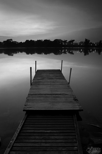
Into the Horizon

i think that's all the viewable pictures I took from last Saturday. Can't wait for the next outing to improve on my pictures.
for the double bridge pic, , if it not wide enough to include what u intended to, do a pano shot and stich it later, coz the other platform is cut off, thus making it look messy, and the tire on the side either u include it in frame or clone it out bcoz its creeping from the side... exposure look find to me anyways....
as for ya into the horizon, it the same as Bro DD comments to nastar, watch out for element crashing, like the platform cuts into the trees reflection...
my 2cents noob worth, keep shooting bro, never give up, im still learning too, hope it helps u....
my noob 2cents worth,
Last edited:

")

") just a thought.
just a thought.


 Luckily I had few shots of them before.