How do you Colour your IR photos?


Wah... Teerex, haha... I think both Lx3ChuA and I were just fishing for more input and opinions from all the experienced shooters here leh...
Hahaha... pai seh...
Thank you very much!


allenleonhart, that depends on what filter one uses.
If you are using an ELP filter or a Goldie filter, you would have loads and loads of colour.
This will make PP-ing a lot easier.
I have an R72 filter, which has significantly lesser colours.
But still, actually, if you look at the PP steps, you would realised that I 'added' in colours only for the subject (the shrine).
This is because the shrine is very dark and I couldn't pull much colour out of it.
But for the rest of the other colours I derived them purely from the intrinsic colours of the picture. No colours added/painted in.

i'm using a citiwide 720nm, shld be close. kinda lost regarding the colors. what do u mean the intrinsic colors of picture?

all i get is ur blue one after channel swap:think: so i cant get the yellow leaves immediately... seems like u have to edit the hue as a seperate layer? correct me if i'm wrong. still starting off:)
 

here's my share...

I've always liked my IR in almost gloomy duotone, especially in landscape shots. Am using adobe cs4, and my workflow is straight and simple.

1. i don't usually channel swap, i use auto level.
2. after auto level, auto tone.
3. hue and saturation. my usual would be -15 saturation, +15 hue.
4. selective color... for some more adjustments.
5. then i use the "multiply" blend mode for my selective color channel. usually i adjust it to 80-65% (depending on what mood i want to achieve) coz it would normally appear dark in 100% blend.
6. some dodging & burning (if need be).
7. unsharp mask. then flatten image.
8. vignette. my usual radius would be 45-35. effect would be 75-90%.
9. flatten (again). then Unsharp mask.

the result would be something like this...

5035885375_755af57d0c_z.jpg


i used an ELP moded cam for this particular shot, now am using an R72 moded unit. the results after PP is almost similar... like this...

5026505383_bab9b56864_z.jpg

i hope this helps... for portrait IR, i usually shoot in-studio.. still learning, so, if anybody share the same passion, please share your PP workflow. if anybody is interested, i'll share my IR portrait workflow. :)
 

limwhow started another great thread and all the inputs by the IR bros been informative so far! :heart:

Wurdelak, 2 really nice shots u got there! Keep it up :thumbsup:
 

hi,

my coloration is very straight forward, 90% of the time i will have traditional colors or bnw IR. is very simple.

10% of the time i might channel swap a bit more, but i don't do anything else.
 

i'm using a citiwide 720nm, shld be close. kinda lost regarding the colors. what do u mean the intrinsic colors of picture?

all i get is ur blue one after channel swap:think: so i cant get the yellow leaves immediately... seems like u have to edit the hue as a seperate layer? correct me if i'm wrong. still starting off:)
allenleonhart, what I meant by the intrinsic colour of the picture was what little colour it had when derived directly out of the camera.
In my example used, the foliage had magenta and blue and red in them.
Thus, you are correct in saying that we need to open up another Hue and Saturation layer, select one colour, say, Magenta and push the Hue Slider of this Magenta until it turns yellow.
This is what I was referring to as pulling the colour out of the picture.
And you have assumed correctly that we will need to keep opening layer after layer of Hue and Saturation.

here's my share...

I've always liked my IR in almost gloomy duotone, especially in landscape shots. Am using adobe cs4, and my workflow is straight and simple.
Brother Wurdelak, thank you very much for coming by and sharing with us your workflow.
In fact, I have been curious about the way you PP your IR photos for they ooze a unique flavour.
But as you have finally shown me, I now understand how you gloomi-fy your shots.
I will give your PP style a try on some of my IR shots one of these days.
Great, great.
Selamat!

hi,

my coloration is very straight forward, 90% of the time i will have traditional colors or bnw IR. is very simple.

10% of the time i might channel swap a bit more, but i don't do anything else.
night86mare, many thanks to you for sharing your workflow.
It's not every day we have the opportunity to look into your inner workings.
Certainly, I would like to say that, as an established photographer like yourself, the composition and story of your photographs have already conveyed more than 90% of the message to your viewers.
And thus, it comes as no surprise that your personal preference is not to do too much PP.
Thank you once again.
 

wah the masters have striked! thanks for the PP lesson! i learnt quite alot just by reading this thread :D
 

师哥 limwhow and 师哥 LxChuA... :thumbsup:

But we are still waiting impatiently for both your free seminar/workshop leh!!! ;p
 

Last edited:
师哥 limwhow and 师哥 LxChuA... :thumbsup:

But we are still waiting impatiently for both your free seminar/workshop leh!!! ;p

No lah ...no 师哥...As Bro Limwhow his pp flow more detail... I learn lot from his pp method... :)

Thxs agains for the bros for sharing their PP method.. :thumbsup:
 

Well Done !! Sticky this post please :D
 

i learned most of my ir processing from this forum and from the stickies. starting out in IR photography is a whole lot of trial and error but rewarding process.
but i would have to agree, to have a good IR photo, composition is very important, then the post processing is simple to complex depending on the outcome one would like it to be.

im using a non modified sony a330 with kit lens. and at the widest angle the lens always have hotspot in the middle as you can see in the picture below taken from the camera without any post processing other than adjusting the white balance. im using an nd720 filter btw the cheap version from citiwide.
5038126447_8716f2764e_z.jpg


initially i only do sharpening and channel swapping to achieve like the below
4922608599_68c9c19203_z.jpg

other than the above, i try to limit the hotspot by doing a slight neutral color swab on the hotspot but the effect can still be recognizable..

then i saw one of limwhow's colored IR and was fascinated by the effect and i began looking at some of my previous IR photos and see if i can do something about them.. and this is one of the final product.
5038127317_c8c8dbffb3_z.jpg

above is still from the same image file but what i did first and foremost was remove all the background building structures which really is an eyesore to my point of view.. then the other one is the hotspot in the middle.
in the above IR, i played more with the exposure and gamma setting in CS5
once i get to the color balance that i want to achieve the process of removing the building in the background is done by a simple cut and paste and erasing. as for the hotspot in the middle, i did a netral color swab to remove the bright overexposed orange.. the rest of the colors from the slight green grass to the blue and slight violet trunk were also done via color swab at about 30% intensity. the stone edges in the bridge were highlighted by applying "multiply mode" set to 20% on all the egdes using a very small brush and then dodging the highlights.
also added a vignette both on the top and bottom. but i do it differently. if i do a vignette i often use the gradient tool, choose the same color of the sky or the item i want to make darker and change the mode to "multiply" 10% and add according to taste.

finally before i save, i do sharpening using a few unsharp mask.
im still in the learning process
 

Last edited:
Thank you for sharing with us your workflow, naynoy.
It is very interesting how you use the Multiply blending mode to enhance the edge of the bridge.
Something that I have never applied before but would be attempting after reading your input.
Once again, thank you very much!
 

ok i think i got it... i'll try out and see what i could get out of it
 

Making Use of Tritone, Masking & Texturize

Allow me to take one step further to share one more of my workflow.
I will always remember what Teerex said: "... you're the painter, and you do the painting...".
Thus I have a tendency to really process my IR photos.

One of my favourite workouts in IR is to create a slightly oldish, rustic kind of feel.
And one such good method is to make use of Tritone (or sometimes Duotone) to render the background.
Again, my thanks to Teerex as this is a method he shared with all of us on one of the thread.

1. Original R72 Photo

Before Channel Swap...

5040227170_b34a674c07_z.jpg

After Channel Swap...
5040228238_72e126347b_z.jpg


2. Rendering Tritone
Make a Duplicate Copy of the Image by going to menu: Image -> Duplicate.
5040230716_b2c4e5a1d4_b.jpg


Then, convert this Duplicate Copy into Grayscale by going to menu: image->Mode->Grayscale.
When asked if to Discard Colour Information - choose Discard.
If asked if to Flatten Image - do so.
5040233662_efe6a4d805_b.jpg


3. Choosing the Tritone

Next, start the Duotone (Tritone) process going by going to menu: Image->Duotone.

5039615043_482784c27c_b.jpg


One of my personal preference is a Tritone scheme that I have customised, as shown below.
The reason why I like it is because it gives me a little bit of dark blue and black, and yet has a little yellow in it.
You may use any pre-programmed Duotone scheme or make your very own according to taste.

5039616309_3183d32eb0_b.jpg


Here, after converting the image to Tritone (or Duotone), we may convert it back to an RGB coloured image by going to menu: Image ->RGB.
This conversion back to RGB will allow us to again play with the colours in the picture.
In my case here, I left the converted picture in Tritone as I will not change much of the background colour later.

4. Merging the Pictures & Masking

Now I will use Command-A (PC: Ctrl-A) followed by Command-C (PC: Ctrl-C) to copy the entire converted Tritone picture.

5039618383_b5f97f1869_b.jpg


Notice that the other copy of the unconverted image is still lingering around behind.

Now I will select the unconverted image (the pinkish one) and use Command-V (PC: Ctrl-V) to paste the entire Tritone image as a new layer onto this image.
You can see the illustration below that in the layer panel on the right side, the original unconverted image and the Tritone image are in their respective layers.

5040240662_280ee6ef14_b.jpg


After that, you can select the two boats using whichever method of selection that you are comfortable with.
Either Quick Selection, Lasso, Magnetic Lasso, etc.. will be able to do the job.
 

5. Revealing the 'Coloured' boats from the layer underneath

Next, using the selection, I create a mask beside the Tritone layer (as shown below) to reveal the coloured, unconverted boats from the original layer below.
There are many ways of doing this.
But my favourite way is to, while the two boats are selected as in the previous illustration:
Press Shift-Command-I to invert the selection, then
press Shift-fn-F5 (PC: Shift-F5) and choose Black to fill in.
This would create a mask exactly like that one shown.

5039621629_4ee8135167_b.jpg


6. Colouring the Boats!

Now this is where I start to enjoy the process.
I would open up a Hue and Saturation layer and copy an inversion of the previous mask onto this H&S layer.
To copy an inverted mask, press Shift-Option and keep these down while dragging the mask in the Tritone layer onto the H&S layer.
Answer yes to the prompt "Replace layer mask".
And now I start to play around with the colours of the boats with my Sliders.

5040243758_ae006b55dd_b.jpg


7. Using Colour Balance

Sometimes no matter how I try, I just can't get the colour I want out of the boat using just a Hue and Saturation layer.
In such instances, I will open up a Colour Balance layer, using the same mask.
In this case, I have purposely masked away the boat on the right side, so that whatever changes I make
on the Colour Balance layer will only affect the left boat (as seen in the layer panel).
Here I played around with all the sliders on Midtone, Highlights and Shadow until I achieve the effects below.

5039624873_d878de21c4_b.jpg


Like our good friend Lx3ChuA said, the PP process is really tedious.
And certainly it is, for here I opened up another Colour Balance layer with a different mask,
this time allowing only changes made to affect only the right boat.
Right after this, I started playing with the Sliders until I achieve the colour I desire for the right boat.

5040247492_39a4a35968_b.jpg
 

8. Adding Texture

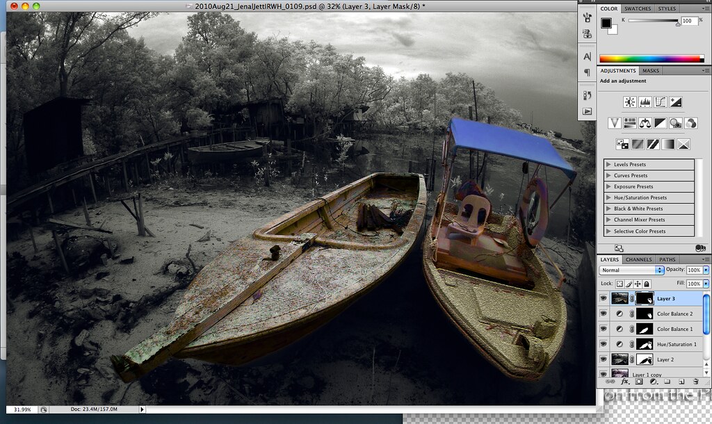
Here I tended to be a little naughty.
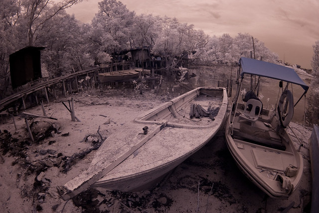
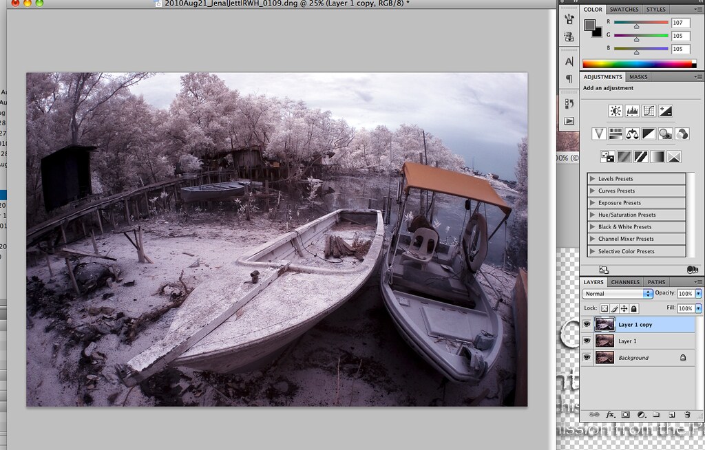
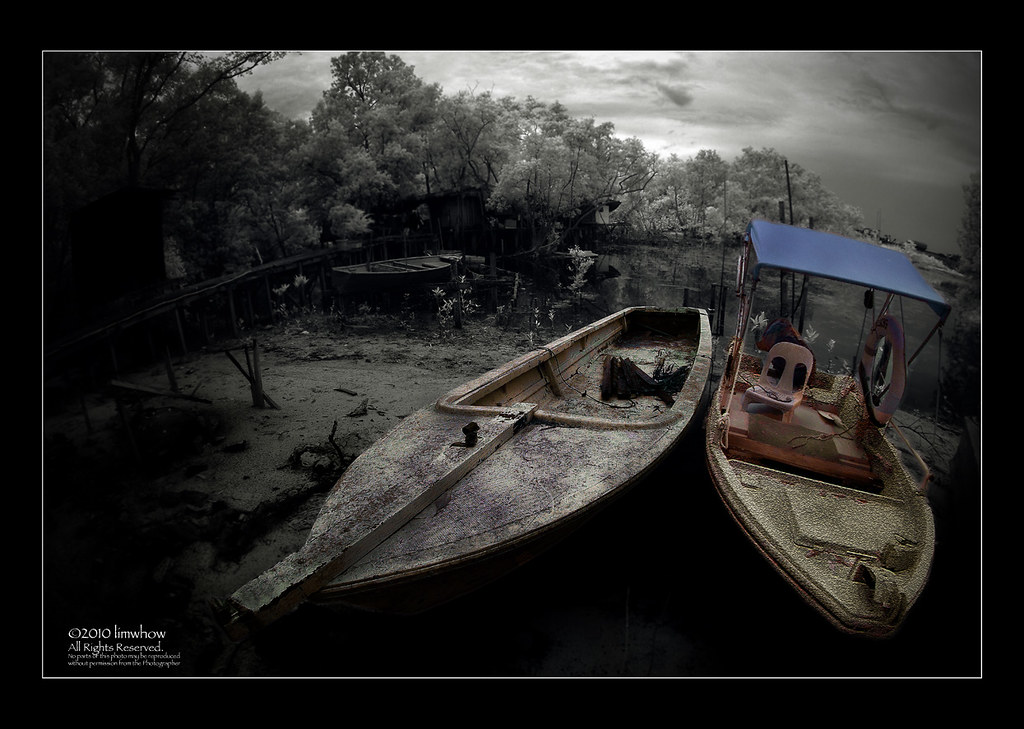
I felt that the boat on the right side was too clean.
And thus I added in Texture (Crack texture) onto its hull.
I did this using menu: Filter->Texture->Crack.
Notice the mask on the layer - it has been masked such that only the front of the boat and the thin strips on the sides are affected by the Texturization.

5039629619_75ab33269c_b.jpg


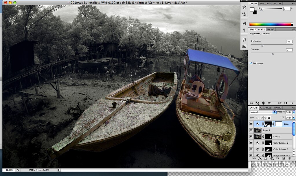
9. Reduce Brightness of the surrounding

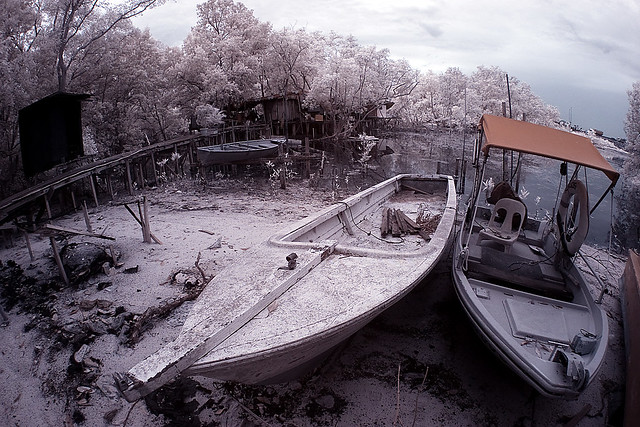
As we looked at the picture, we would by now realised that the ground around the boats are a little bright for comfort.
I have a tendency to reduce the brightness of the surrounding areas slightly to bring attention to the subjects.
Here I open up another Brightness and Contrast layer, and reduce the brightness of the ground with the appropriate mask.

5039633099_7d81bbc0c0_b.jpg


If you look carefully, you can see that I did a Gradient Tool on the mask itself so that there is a graduated change.
This means that the ground on the lowest part of the frame is darkest, while some where in the middle of the picture, the brightness of the ground is at its original level.
This is to give it some realism.
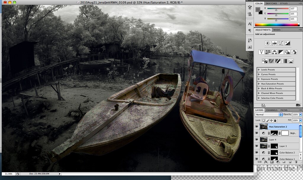
10. Dodge and Burn

This is also one of my favourite parts - Dodging and Burning.
Again, I followed what I deem the natural path of the shadow on the hulls of the boat, and the areas around them.
One interesting thing I have come to realise it that, often times as I burn, the colour on that 'burnt' area becomes a little more intense.
This is great because it gives the hull of the boat more feeling.

5040257168_02bff23d96_b.jpg


I personally feel that Burning and Dodging is pretty important because it breaks the monotony of an otherwise dull, boring surface (as in the hull of the boat on the left side).
You can compare the left boat before and after Burning to see the difference.

11. Surface Blur

Learning this trick from our good friend Lx3ChuA, I duplicated another layer with Command-J, and did a Surface Blur (menu: Filter->Blur->Surface Blur) of 3 on the whole picture.
After that I created a layer mask beside it, and used the Paint brush to paint, with Black, over the area that I want to remain sharp.
This creates sharpness over the subjects and a little bit of Blur (not too much) over the near foreground area and some parts of the background area.
It serves to isolate the subject further.

5040259652_c901cde0a9_b.jpg
 

12. Vignetting and Final Product

After a final layer of Hue and Saturation to reduce the Blue of the Canvas of the right boat to render it more toned-down,
I flattened the whole image and did a vignetting over the corner using the menu: Filter->Distort->Lens Correction function.
As mentioned previously, I push the Slider on the Vignetting Amount to the left until I am happy with the amount of vignette.

Finally I created a frame over the picture.

5040228770_3e8076d1bf_b.jpg


I apologise for taking up all five posts in describing this workflow.
But since so many brothers have generously put in their processing procedure, I thought I'd just share mine too.
Hope this would be of some help to our new IR members in processing their IR photos.
 

Wow lau!!!! Such detail explanation ... I certain learn alot from this...!!! Conduct courses I don't even mind to pay... Even better than those paid course... ")

Such unselfishness ... U really put mi to shame... Really proud to have u as my Brother!!! :thumbsup:
 

@LowLights, fatigue, airforce1, wongcho, wormz777, dexpense, garth6, SurrealDreamWalker, nleong - thanks for dropping by and for giving us the encouragements.

@Lx3ChuA - no lah, not me lah. You see all the experienced IR shooters are sharing their PP workflow here. And this is simply marvellous.
In the spirit of sharing and promoting IR photography as a genre of photography, it is good that we make public some of the PP processes we all learned along the way.
This will break the entry barrier for all new IR shooters so that any newcomers into the world of IR will find himself/herself starting to PP effectively.

There is much more to learn and to discover.
And hopefully one day some of our talented new shooters after us can attain the high level of IR Photography like our Indonesian counterparts.
 

Wow lau!!!! Such detail explanation ... I certain learn alot from this...!!! Conduct courses I don't even mind to pay... Even better than those paid course... ")

Such unselfishness ... U really put mi to shame... Really proud to have u as my Brother!!! :thumbsup:

Put you to Shame then me leh.. Got nothing to share..cause I don't PS so much :embrass: