r00ki3
New Member
#63 - walkabout organized by YSLee, Kit, Red Dawn

:thumbsup::thumbsup: i'm an easy man to please too
") ;p
;p#63 - walkabout organized by YSLee, Kit, Red Dawn
;p:thumbsup::thumbsup: i'm an easy man to please too
")
- note to self... wondering if jpeg renditions of my pix (bottom right and left corners) are adding stuffs due to Picasa or just my way of processing pix.
- self-answer... combination of trying to recover shadow but it's also Picasa coz original processed picture didn't have as much jpeg problems.
Normally I load up as 1600 which already has the issues. So tried reloading as full sized pix... and for some reason can't retrieve the uploaded pix :-\ silly picasa
This one swee leh bro
Some UWA angle photos from the dark
#43

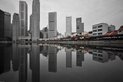
Ei bro...would you mind me askin....which part of singapore would this be? thanks!
Ei bro...would you mind me askin....which part of singapore would this be? thanks!
perhaps u could give it a tighter vertical crop to showcase just the clouds, sunrays and boat, and leave out the the larger portion of the sea (bottom portion of the pic). in that way the eyes are drawn directly to the more interesting subject of the boat and not to the large expense of the sea. in 82 i would suggesting placing the horizon at a more center level, giving more space to the water reflections and less to the sky. with that i guess the symmetrical balance of the picture would be accentuated. nice photos u have here, i'm learning much from ur works.hi there wildcat,
i thought #80A was a more timely capture
gotta love the reflections in 81-82
just my two cents
cheers,
marc


