mimik07
Senior Member
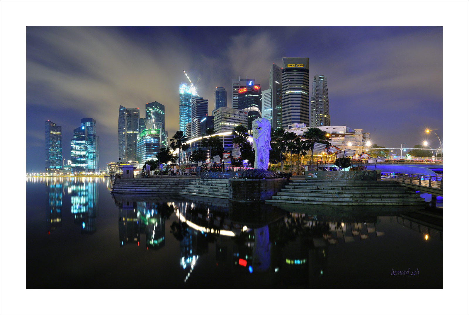
Thanks for the feedback. Will take note of the weightage issue, and relook at it againhowever when I took the pic (no cropping for this) I did intentionally include everything that was in the pic with balance in mind.
I assume #75 has the same problem? (that one was cropped at the bottom, wasted empty space)
Somehow #75 seems better to me with the tighter crop. The reason why I thought #76's composition was left-heavy was partially due to empty space below. Taking it at such a wide angle left the right side pretty empty (not sure if you get what i mean). Then again its all subjective so there's no right or wrong. Like CT mentioned, I think you've done a very good job capturing this "shot to death" cityscape from an interesting angle.
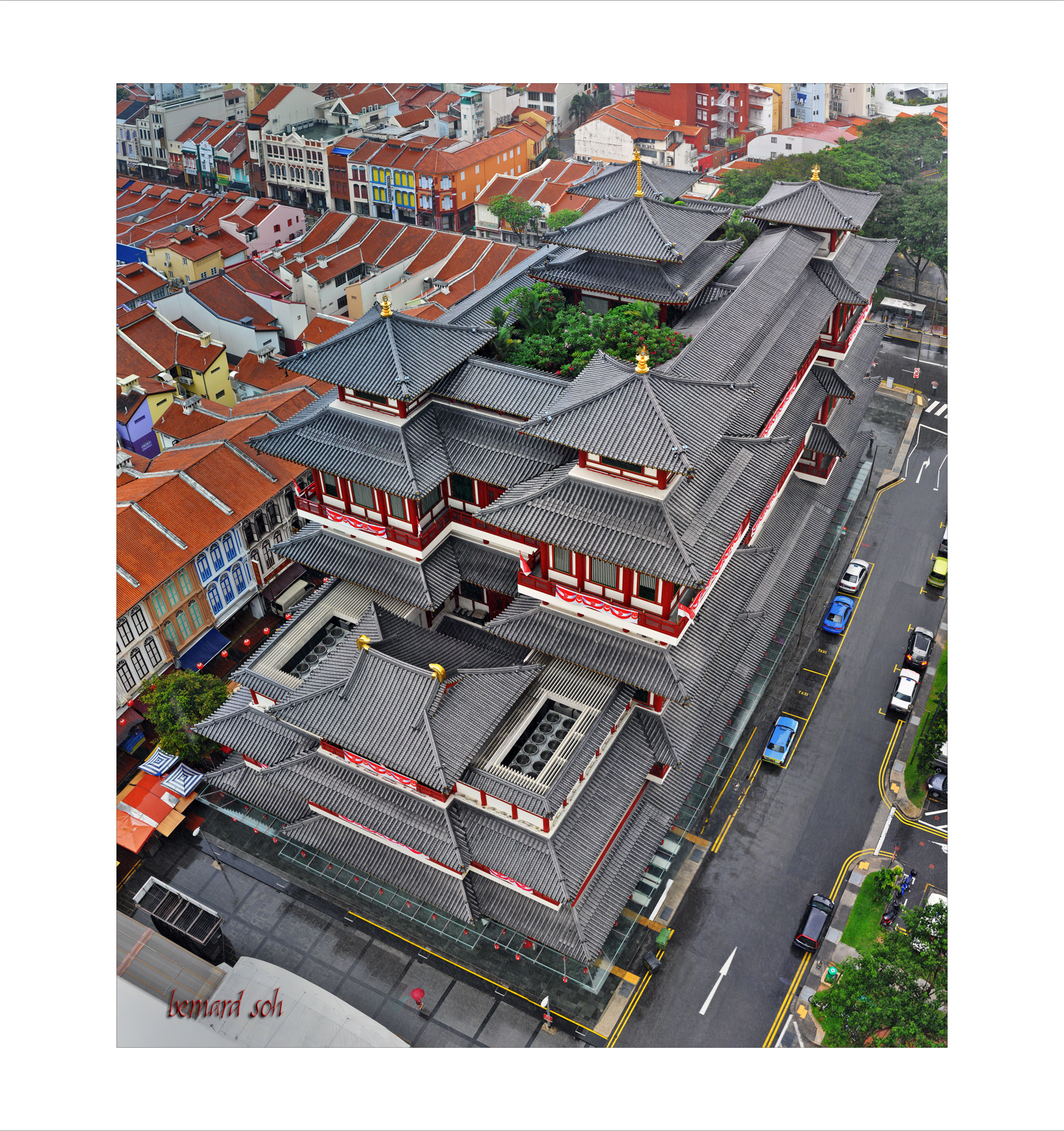
Oh yes, forgot to mention. I really like the metallic feel of #72! :heart:

")