portrait - blast from the past!


Status
Not open for further replies.

stupidbloke

New Member
Jan 12, 2007
378
0
0
nikonem.jpg


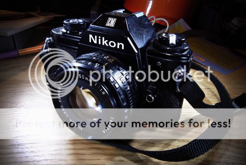
this is a "portrait" i took of my nikon em. for this photo i wanted the studio look, ie: 3 point lighting. i wanted it to look as if my em was modeling and the stage was like an office workspace. cause the em is a light portable slr. i believe it was used by semi pros maybe journalists with no accompanying photographer.

in managed to get the studio look using a single sb600. i also put the clutter in the background in the hope of accentuating the theme.


personally i think ive managed to stick with the theme i set out for. would like comments on the basic colour and contrast editing. and any other things you find needs to be picked out.

thanks cheers.
 

The background clutter is too much. Its getting distracting and snatchin attention away from your subject. Agreed that you might want to have it compliment the theme, but could the DOF of the background be thinner? Thus having the clutter you have placed blend in the background and not snatching the attention from the camera.
 

think the picture will look better without the stuff at the background.
 

Currently you've shown too little 'background', we can't identify how it might be suitable to your theme and thus it's distracting. The scene does not suggests a newsdesk. It's hard to imagine why a journalist would keep his desk messy but to clear a spot for the camera. Is he/she a writer who views the camera as a tool or a photographer who views writing as a pain? Make up a little background story.

Place prominent objects of Nikon EM era, get film spools, contact sheets, stacks of newspapers, etc. If you're going to recreate a scene it's better to go all the way than half-way. You could have removed the straps, or tucked it behind the camera neatly. Condition of camera is distracting too, choice in lighting emphasised that.

No issues with colour and contrast. It's ok.
 

Personally, i feel that the angle of the shot should be lower... abit too high for my liking, the color and contrast are :thumbsup:
 

Very daring attempt to call it a portrait. Good adding of vignetting to narrow down viewer's view.

Unlike others, I will not fault you for the background, for they lack understanding that you want to increase the details of the camera subject itself which would automatically results in the increase detail of the background. I find the messy background quite interesting instead, they are not distracting and also add the feel of "junkyard gold" to the photo.
 

if you want a studio look,

why did you not arrange the camera nicely? would have actually preferred the strap taken out.
 

Heres my comments about the photo.
The background is distracting. It doesnt show anything of the past. More bokeh and remove unnecessary things.
How about putting some old films in background, old faded photos or albums.
The bright lighting on the table left is catching the attention.
The camera strap on the right.
Table wooden lining.
Keep it simple... :)

Which want is your main target to capture viewers eye?
Lighting and contrast is good.
 

Last edited:
A simple and plain background will be better :)

IMHO colour u can try out monochrome effects too. just another suggestion
 

Status
Not open for further replies.