
Hi i'll be posting my shots here for C & C. Willing to accept anything u guys comment on. No probs jus shoot me. Thanx i believe thats wad i need. ")
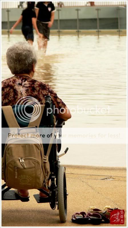
hmm...if your subject is the old lady, than it will be better if she is not cut off on the left side.
but overall the impact is there.
care to explain what you wanna to tell from this photo? thanks
not sure wad it expresses but hope to see more suggestions on how i can capture it. 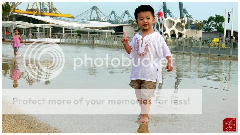
Heres a new image.
Well i have the my album online but hm... i just go one by one ? or jus post link here .. n get critics here ?
This image of a boiboi, BAM he is cute.
Hi i'll be posting my shots here for C & C. Willing to accept anything u guys comment on. No probs jus shoot me. Thanx i believe thats wad i need.
this picture is visually too heavy on the left side. the right side seems almost entirely redundant if not for the shoes below. i don't feel comfortable about the colour cast as well, doesn't seem to convey the mood fitting for the theme. try not to place your signature on important objects within the frame.
this photo shows as if a father taking pictures of his son so that next time can show it to him. haha...
hm ok hehe i agree.. the signature is indeed quite..... hehehe but i duno where to place it le. the angle of the signature seems only fitting onto the right bottom. thanx for the comments ..
it's best to keep it in a neutral colour (black or white) and translucent (30%-50% opacity) as well so as not to become attention grabbing.Hey, in my opinion only.. I thought your 1st pic looked a bit like those anti-theft, "beware of your belongings" type of poster, with the bag fully exposed and owner being a wheel-chaired old lady.