
Many of us love it...
- Thread starter kit90210
- Start date
You are using an out of date browser. It may not display this or other websites correctly.
You should upgrade or use an alternative browser.
You should upgrade or use an alternative browser.
- Status
- Not open for further replies.


It does not make me feel good ...
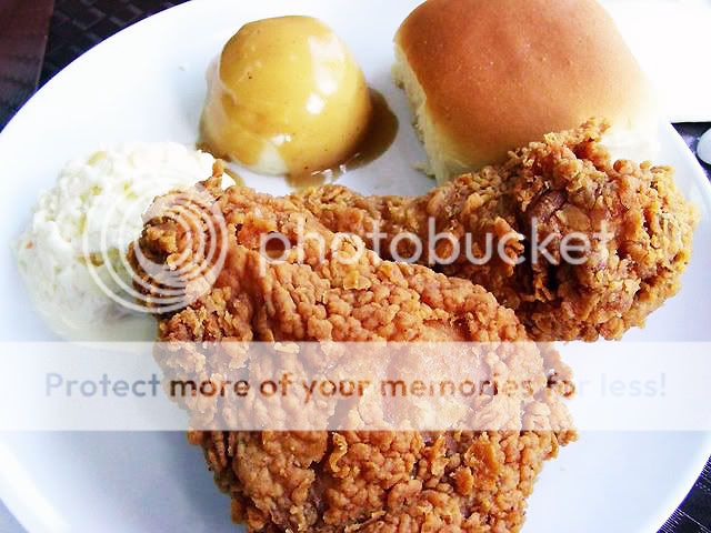
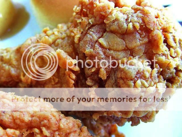
Second that. You make the yummies look not yummy anymore. Maybe you were too close. Try not going so close for the shots and they might look better. Ok, now you can order more fried chicken to shoot
")
Second that. You make the yummies look not yummy anymore. Maybe you were too close. Try not going so close for the shots and they might look better. Ok, now you can order more fried chicken to shoot
:bsmilie: thanks for the tips! Will take note! :sweat:

it does not make me feel good too...
in fact, it makes me feel bad...
no offense,
somehow the pictures brings out the harsh health facts of eating fried food.
Instead of enticing me to eat,
it reminds me of cholestrol, high blood pressure etc...
it reminds you that you are eating fried stuff..
it reminds you that you are going to swallow oil caked fried skin
i think you need to remove those "reminders" from the shots you take... =)
As an analogy of what I meant,
maybe its because its looks like "lard"...more than it looks like "butter"
Good comments! :thumbsup: Very accurate expression of thoughts. Maybe the pics would really encourage others to opt for alternative food?
Maybe the pics would really encourage others to opt for alternative food?

Not bad..
you manage to bring out the "Vitamin C" in this pic...
however, one minus point... i think you only manage to bring out 20% of the vitamin C...
the other 80% comes from layout of the supporting elements in the pic..
the lightening... the arrangement.........
the freshness....the vibrant colours to compliment the healthy element.........
think "Cold Storage"
and you will achieve the dew of freshness in your pic =)
Another thing is the white balance. Your first two photos of fried chicken have a bluish white point, while the berries are yellowish.
Note the background too... The inclusion of some brownish (floor?) in the plate photo is distracting, while there are plastic bags in the berries.
Note the background too... The inclusion of some brownish (floor?) in the plate photo is distracting, while there are plastic bags in the berries.
Not bad..
you manage to bring out the "Vitamin C" in this pic...
however, one minus point... i think you only manage to bring out 20% of the vitamin C...
the other 80% comes from layout of the supporting elements in the pic..
the lightening... the arrangement.........
the freshness....the vibrant colours to compliment the healthy element.........
think "Cold Storage"
and you will achieve the dew of freshness in your pic =)
:thumbsup: Wow...thanks Richliow for your accurate and precise descriptions and analogy...I can really associate with your comments...Good advice!!!
Berries really don't seem like real to me.
Maybe the colors should be more natural.
Can this be due to the "Vivid" colour mode that I switched to in my camera? The berries are really real...by the way, the black berries in the pic are significantly sweeter than the red ones.
All along, I thought that the red ones look more delicious though until I tried them in New York Chinatown. Each punnet of 250g cost US$2 only. Singapore would cost much more, I think. ;p
Another thing is the white balance. Your first two photos of fried chicken have a bluish white point, while the berries are yellowish.
Note the background too... The inclusion of some brownish (floor?) in the plate photo is distracting, while there are plastic bags in the berries.
:thumbsup: Hey, Xray, sharp observation...really live up to xray vision...you actually can determine the white balance is flawed and the background in the pics!!! :bsmilie:
Will take note of the background in future. But how do I correct the white balance? I actually set White Balance to auto. The other options are White balance preset, Daylight, Incandescent and Fluorescent...so if the photos are taken indoors such as the fried chicken and berries, should I use Fluorecent and Incandescent respectively:think: ?
a bit of ps to make it a bit tastier
Wow...amazing!:bigeyes: How did you do that? :thumbsup: :thumbsup: Looks much better now....:bsmilie: Can this special touch be applied to the other photos in this thread too?
nothing much fanciful actually.. just a couple of simple steps in attempt to make the food leap out of the screen. i think some pals here would be able to do it better thoughWow...amazing!:bigeyes: How did you do that? :thumbsup: :thumbsup: Looks much better now....:bsmilie: Can this special touch be applied to the other photos in this thread too?
just applied autocolor cuz i was a little lazy for manual manipulation and that solved the whitebalance issue..
1. i thought your chicken was a little wash-ed out so i decided to sharpen some details
2. adjusted a bit of shadows, just a tiny bit
3. adjusted hue/saturation and curves
can be better though
treated the same way
- Status
- Not open for further replies.
Similar threads
- Replies
- 0
- Views
- 91
- Replies
- 0
- Views
- 67
- Replies
- 0
- Views
- 61
- Replies
- 0
- Views
- 69