
A shot taken from a recent holiday trip....
On the way back to Singapore~
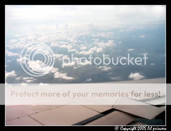
#1 - Colour
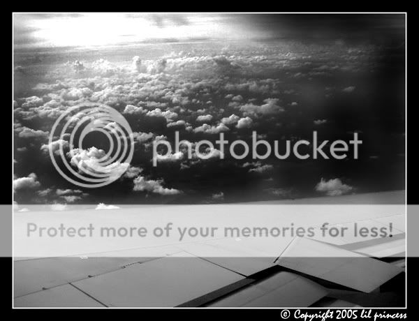
#2 - B/W
Comments, people?
On the way back to Singapore~
#1 - Colour
#2 - B/W
Comments, people?
")
I like the B&W better... maybe because of the better contrast for the cloud.lil_princess said:
#2 - B/W
Comments, people?
My focus was actually on the cloud pattern.melvin said:Color version think exposure is a little over at the cloud ... btw ur focus is on wing or cloud?
Prefer B & W version...
can see more DOF n details of the cloud!:thumbsup:
Above r Just my personal opinon can chose to ignore if u think its crap!
can i know wat r ur settings?
I used the burn tool.. the contrast wasn't like that actually..SnapSnap said:I like the B&W better... maybe because of the better contrast for the cloud.
lil_princess said:My focus was actually on the cloud pattern.
I personally prefer the b/w version too... but whats DOF?
lil_princess said:I used the burn tool.. the contrast wasn't like that actually..
melvin said:Huh??? Wats the burn tool?:dunno:
Sorry me still a new newbie!
and in this case, I used it to make the sky to have a darker contrast...zaren said:it's a tool in photoshop for making selected parts of the digital image darker.
lil_princess said:and in this case, I used it to make the sky to have a darker contrast...
actually i have a copy of the same image but not so 'burnt'.. but i felt this is better...
Cathay Pacific. I was sittiing at the 2nd last row from the back..bwilly said:#2 gives me a pre-war world II kind of feeling. :what:
#1 should look better if you can boast the colour using PS.
White balance seem to be out, the wing looks brown to me.
What plane are you taking??
Overall composition pretty oki, along the 2/3 rule.