silver.wolf
Senior Member
professional works! :thumbsup:
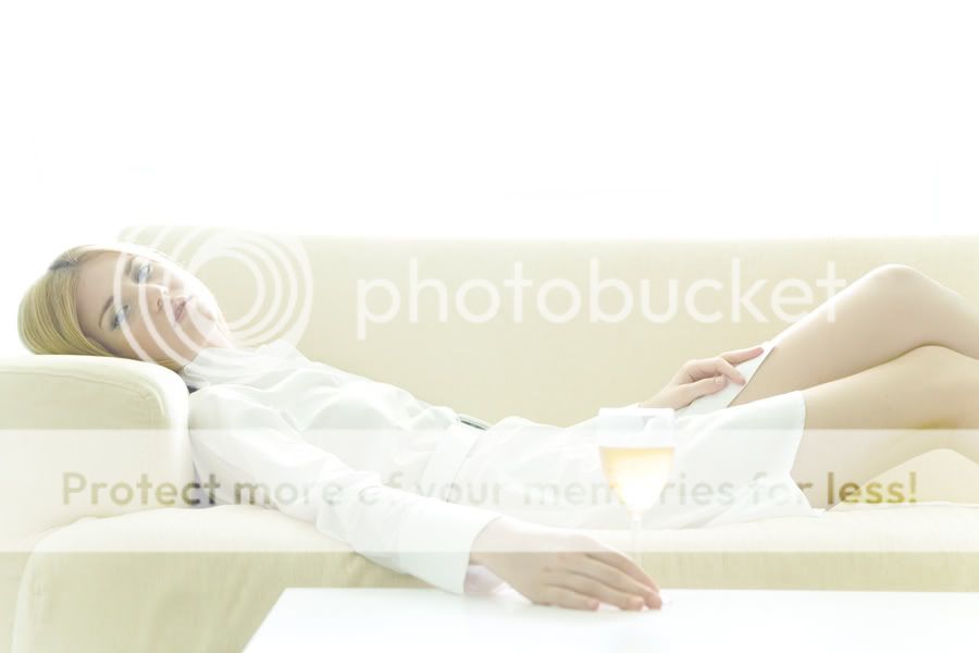
the underleg coloration is weird is 4 and 5.
")
All are :thumbsup: and I like #4 most.
If the model expression more at ease will bring out the relax feeling to match the high key mood. Just my 2 cents.
thanks!Agree with deadpoet, last 2 is coool!
I'm going to be candid but I'm no Simon Cowell. I think all your pictures lighting is not right. It's taken with alot of strong frontal or side lighting and is over bearing. Maybe you are trying to creat a mood and its tough exercise given the strong lighting condition. The contrast is also flat.
Just my opinion.
Cheers
Styling - Adrian
Makeup - Lyndnn
Model - Cran
cheersI'm going to be candid but I'm no Simon Cowell. I think all your pictures lighting is not right. It's taken with alot of strong frontal or side lighting and is over bearing. Maybe you are trying to creat a mood and its tough exercise given the strong lighting condition. The contrast is also flat.
Just my opinion.
Cheers
:bigeyes: under the right leg...didnt photoshop properly?..LOVELY picture overall
i love 4&5 very much. but there's a lot of blown details on the image.
I'm going to be candid but I'm no Simon Cowell. I think all your pictures lighting is not right. It's taken with alot of strong frontal or side lighting and is over bearing. Maybe you are trying to creat a mood and its tough exercise given the strong lighting condition. The contrast is also flat.
Just my opinion.
Cheers
What details are you looking for? I see lots of detail in the picture. Oh, you must be referring to the washed out window. Yes, must agree with you, the details from the windows all blown, nuked, gone!
I doubt this image is lit with frontal or side lighting. It is really not a case of right or wrong. You may like or dislike a piece of work, but even if you like it, it does not automatically means right, and for those you do not like, the are now wrong either.
Damn, the mood is fantastic. The lighting is actually rather simple from what I see. Why do you say iot's tough???
Love the washed-out effect. Please share your tricks if you dont mind.