RSSNewsFeeder
Member
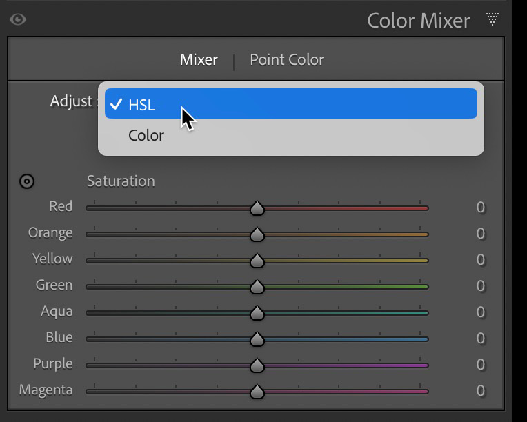
In the 2023 Adobe MAX release of Lightroom Classic, Lightroom, and Camera Raw we got a few new editing tools to add to our workflows. In this article we’re going to learn the ins and outs of the new Point Color tool, which can be found in all desktop versions of those products. First thing to note is that the HSL/Color panel has been modified and renamed to Color Mixer, which brings it into line with the panel of the same name in Lightroom. The controls for old Color panel that allowed for adjusting the hue, saturation, and luminance of a single color (within a fixed range of similar colors) is now accessible via a drop-down menu under the Mixer tab within the panel.
The real news is that we gained the Point Color panel that allows for much finer control over a customizable range of color. The HSL panel remains unchanged and is still quite useful. So, what does Point Color do that the HSL panel cannot? There are two key functions of Point Color that differentiate it from HSL, first being that Point Color allows us to fine tune the range of affected colors with a high degree of control, whereas each specified color in the HSL panel affects an unchangeable range of similar colors.
We’ll look at some example photos to show why that is important. The second key difference is that Point Color is available as a global adjustment (affecting all selected colors in the entire photo at once) and as a local adjustment in the Masking panel. Taken together it means that while HSL can be quite useful when you are happy with adjusting the predetermined range of colors affected by each slider, we now have a tool that gives us far more control to narrow in on a very specific range of colors and make desired adjustments both globally and locally. Let’s look at some examples to see how this works.
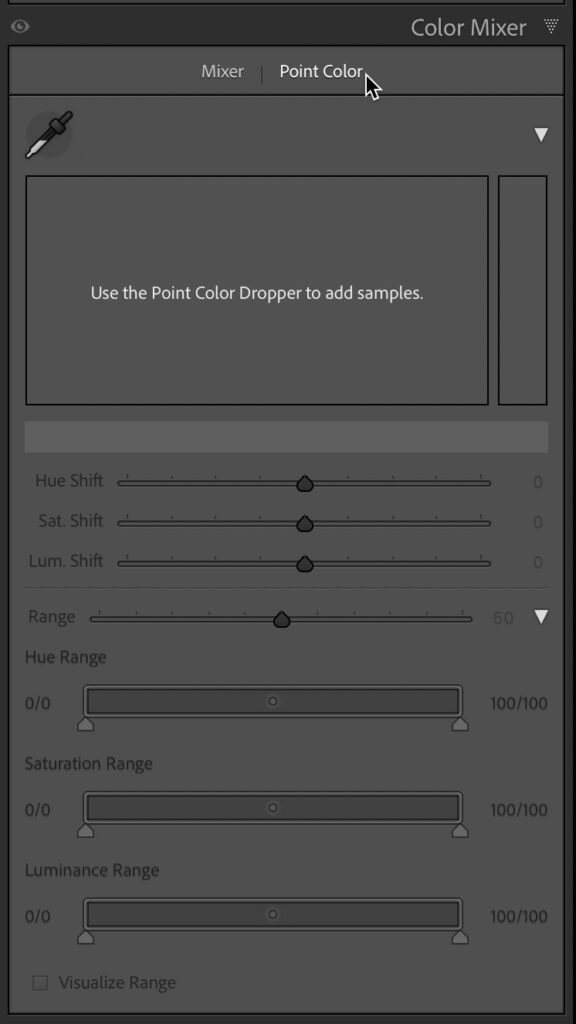
When you first view the Point Color panel there is not much to see, but as soon as you grab the Sample Spot Color (Eyedropper) tool and click on the color you want to sample it comes to life. Note, I have expanded all the disclosure triangles in the panel to reveal all the options.
Next to the eyedropper you’ll see a color swatch representing the selected color (note, as you adjust the color this swatch will change to show both the original selected color and the adjusted color). Below that is a large color field displaying the selected color (indicated with a black pin) within the range of hues that will be affected. Below the color field is a color bar displaying a larger view of the selected color (this also changes to show the original and adjusted color). To the right of the color field is a color rectangle that shows the selected color within a range of luminance values.
With the color selected you can now adjust that color’s hue, saturation, and luminance as desired by dragging within the color field or color rectangle or by moving the Hue Shift, Saturation Shift, or Luminance Shift sliders. Dragging left or right within the color field adjusts the Hue Shift. Dragging up or down in the color field adjusts the Sat. Shift. Dragging up or down in the color rectangle adjusts the Lum. Shift. As you make adjustments by dragging in the color field, you’ll see how the corresponding sliders move in concert. Likewise, moving any of the sliders results in seeing a white circle move in the corresponding color field to represent the resulting change.
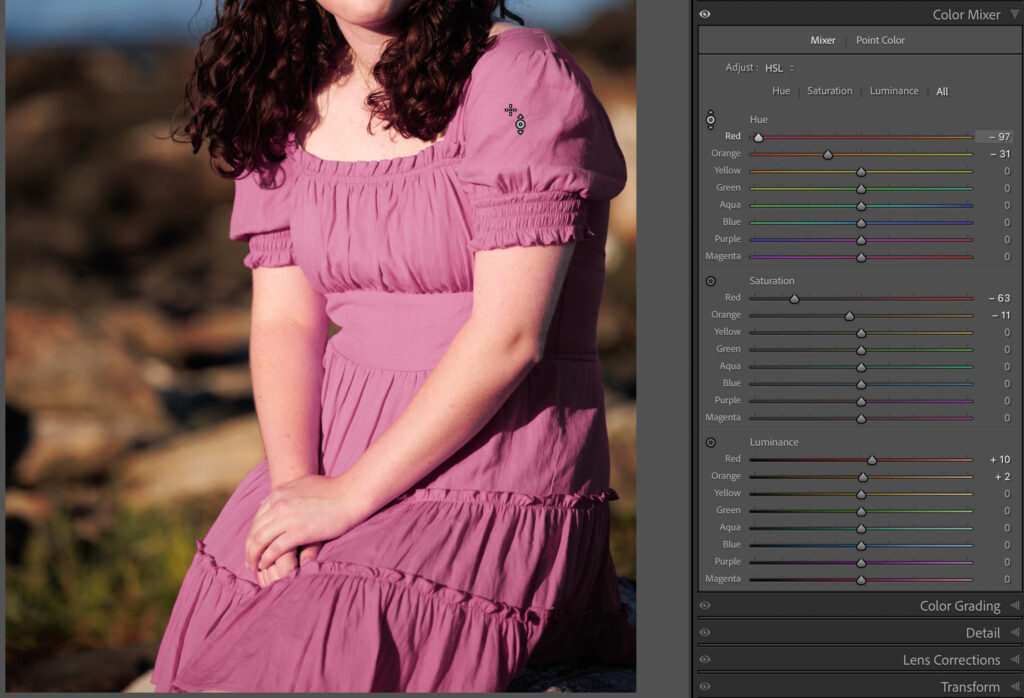
Let’s say I wanted to shift the color of this young woman’s dress from a very saturated red to a less saturated pink. If I were to use the Targeted Adjustment tool in the Mixer tab I could try to shift the hue, saturation, and luminance towards a more pink color, but because the original color was so similar in hue to her skin tone, the end result is less than desirable. There’s no way to constrain the range of affected hues with this tool or use it with Masking.
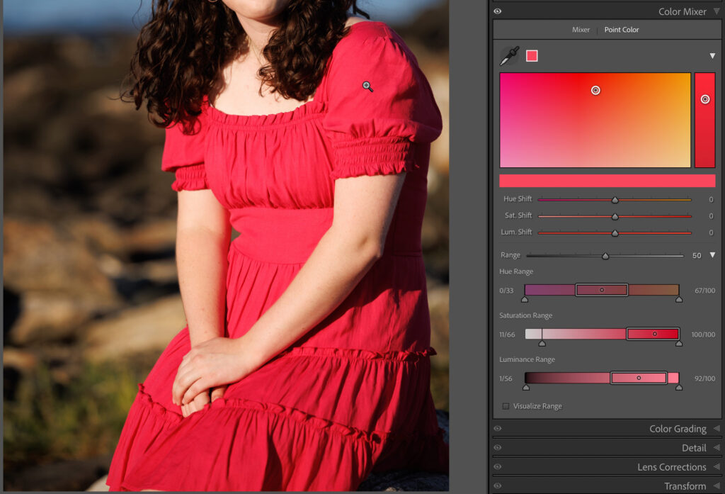
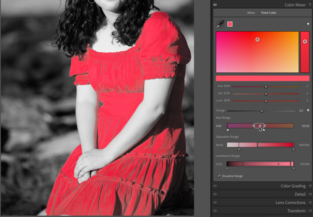
Let’s reset those adjustments and switch to the Point Color tool. I’ve used the eyedropper to sample the color of the dress. Looking at the colors in the color field I can tell I’m going to run into the same issue I had before, so let’s use the Range controls to see if I can limit the range of affected color to avoid affecting her skin and lips. The Range slider can be shifted right to expand the range of affected color or shifted left to decrease the range. With the Range disclosure triangle expanded we can access more granular controls for fine tuning the hue, saturation, and luminance range I want to adjust. In a case like this it can be helpful to check the Visualize Range box, which changes the unaffected colors to grayscale and leaves only the affected range in color.
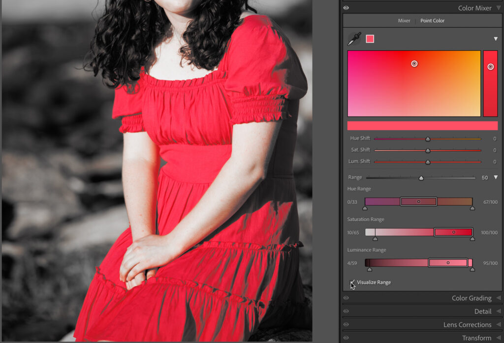
Now we can clearly see areas of her arms and face that will be affected if I don’t constrain the range of affected colors.
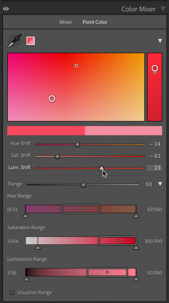
With the range dialed in to just affect the dress I can now make the desired shifts in hue, saturation, and luminance to change the color of the dress without affecting her skin.
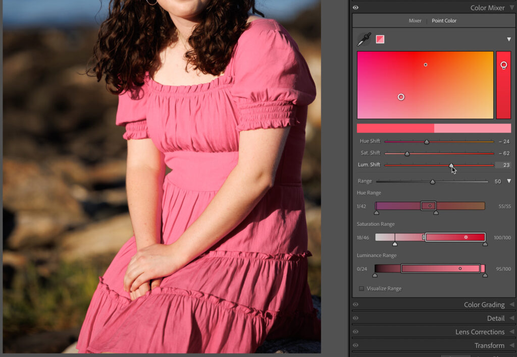
That type of adjustment was just not possible before using HSL alone since we had no way to customize the range of hues being affected by the adjustment. As close as the color in the dress was to some of the color in her skin tone, I was able to limit the affected range of hues narrowly enough to effectively isolate the dress from her skin, but there’s even more power in Point Color than in just limiting the range.
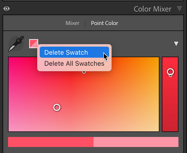
In that example I was just (barely) able to isolate the color I wanted to adjust from the subject’s skin tones, but what if limiting the range of colors wasn’t possible, or the same color existed in more than one place within the photo, and you only wanted to adjust one location? That’s where Point Color’s other difference over the Mixer (HSL/Color) can be found, which is in Masking. I’m going to reset/remove the global Point Color adjustment by double-clicking the Point Color label at the top of the panel. Alternatively, you can right-click a color swatch and choose to delete the swatch (or all swatches) from the contextual menu, which does the same thing.
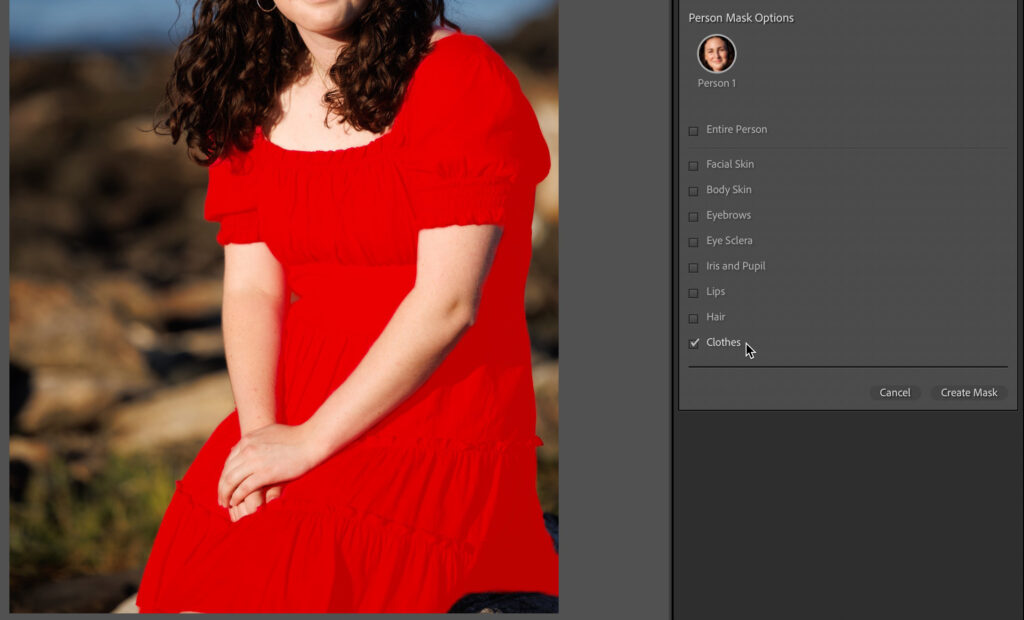
Next, click the Masking icon to enter that tool. Since I have a person in this photo I can leverage the AI-based masking ability to select just her dress with a single click on the Clothes checkbox under Person Mask Options, then click Create Mask.
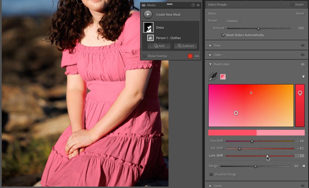
With her dress masked, I can expand the Point Color panel and use the eyedropper to sample the color of her dress as I did before. With Masking, you’ll likely see the overlay by default at first, but as soon as you select the eyedropper the mask is hidden so you can see what you are sampling. Thanks to the mask I don’t need to worry about constraining the color range as this adjustment (and any other adjustment I decide to apply to this mask) will only affect her dress. That means I can just focus on adjusting the color of the dress right away.
There’s often more than one way to achieve an adjustment, and the right way will depend on the photo and what you are trying to achieve. With Point Color you have such a fine level of control that just wasn’t possible in Lightroom before, and we still can utilize the HSL/Color controls too. This opens wonderful possibilities for fine tuning skin tones, removing color casts from shadows, adjusting product photography to better match the desired color, and so much more.
The post Get to Know Point Color in Lightroom Classic appeared first on Lightroom Killer Tips.
Continue reading...
The real news is that we gained the Point Color panel that allows for much finer control over a customizable range of color. The HSL panel remains unchanged and is still quite useful. So, what does Point Color do that the HSL panel cannot? There are two key functions of Point Color that differentiate it from HSL, first being that Point Color allows us to fine tune the range of affected colors with a high degree of control, whereas each specified color in the HSL panel affects an unchangeable range of similar colors.
We’ll look at some example photos to show why that is important. The second key difference is that Point Color is available as a global adjustment (affecting all selected colors in the entire photo at once) and as a local adjustment in the Masking panel. Taken together it means that while HSL can be quite useful when you are happy with adjusting the predetermined range of colors affected by each slider, we now have a tool that gives us far more control to narrow in on a very specific range of colors and make desired adjustments both globally and locally. Let’s look at some examples to see how this works.
Getting Oriented
When you first view the Point Color panel there is not much to see, but as soon as you grab the Sample Spot Color (Eyedropper) tool and click on the color you want to sample it comes to life. Note, I have expanded all the disclosure triangles in the panel to reveal all the options.
Next to the eyedropper you’ll see a color swatch representing the selected color (note, as you adjust the color this swatch will change to show both the original selected color and the adjusted color). Below that is a large color field displaying the selected color (indicated with a black pin) within the range of hues that will be affected. Below the color field is a color bar displaying a larger view of the selected color (this also changes to show the original and adjusted color). To the right of the color field is a color rectangle that shows the selected color within a range of luminance values.
With the color selected you can now adjust that color’s hue, saturation, and luminance as desired by dragging within the color field or color rectangle or by moving the Hue Shift, Saturation Shift, or Luminance Shift sliders. Dragging left or right within the color field adjusts the Hue Shift. Dragging up or down in the color field adjusts the Sat. Shift. Dragging up or down in the color rectangle adjusts the Lum. Shift. As you make adjustments by dragging in the color field, you’ll see how the corresponding sliders move in concert. Likewise, moving any of the sliders results in seeing a white circle move in the corresponding color field to represent the resulting change.
Putting in Practice
Let’s say I wanted to shift the color of this young woman’s dress from a very saturated red to a less saturated pink. If I were to use the Targeted Adjustment tool in the Mixer tab I could try to shift the hue, saturation, and luminance towards a more pink color, but because the original color was so similar in hue to her skin tone, the end result is less than desirable. There’s no way to constrain the range of affected hues with this tool or use it with Masking.
Let’s reset those adjustments and switch to the Point Color tool. I’ve used the eyedropper to sample the color of the dress. Looking at the colors in the color field I can tell I’m going to run into the same issue I had before, so let’s use the Range controls to see if I can limit the range of affected color to avoid affecting her skin and lips. The Range slider can be shifted right to expand the range of affected color or shifted left to decrease the range. With the Range disclosure triangle expanded we can access more granular controls for fine tuning the hue, saturation, and luminance range I want to adjust. In a case like this it can be helpful to check the Visualize Range box, which changes the unaffected colors to grayscale and leaves only the affected range in color.
Now we can clearly see areas of her arms and face that will be affected if I don’t constrain the range of affected colors.
With the range dialed in to just affect the dress I can now make the desired shifts in hue, saturation, and luminance to change the color of the dress without affecting her skin.
That type of adjustment was just not possible before using HSL alone since we had no way to customize the range of hues being affected by the adjustment. As close as the color in the dress was to some of the color in her skin tone, I was able to limit the affected range of hues narrowly enough to effectively isolate the dress from her skin, but there’s even more power in Point Color than in just limiting the range.
Point Color in Masking
In that example I was just (barely) able to isolate the color I wanted to adjust from the subject’s skin tones, but what if limiting the range of colors wasn’t possible, or the same color existed in more than one place within the photo, and you only wanted to adjust one location? That’s where Point Color’s other difference over the Mixer (HSL/Color) can be found, which is in Masking. I’m going to reset/remove the global Point Color adjustment by double-clicking the Point Color label at the top of the panel. Alternatively, you can right-click a color swatch and choose to delete the swatch (or all swatches) from the contextual menu, which does the same thing.
Next, click the Masking icon to enter that tool. Since I have a person in this photo I can leverage the AI-based masking ability to select just her dress with a single click on the Clothes checkbox under Person Mask Options, then click Create Mask.
With her dress masked, I can expand the Point Color panel and use the eyedropper to sample the color of her dress as I did before. With Masking, you’ll likely see the overlay by default at first, but as soon as you select the eyedropper the mask is hidden so you can see what you are sampling. Thanks to the mask I don’t need to worry about constraining the color range as this adjustment (and any other adjustment I decide to apply to this mask) will only affect her dress. That means I can just focus on adjusting the color of the dress right away.
There’s often more than one way to achieve an adjustment, and the right way will depend on the photo and what you are trying to achieve. With Point Color you have such a fine level of control that just wasn’t possible in Lightroom before, and we still can utilize the HSL/Color controls too. This opens wonderful possibilities for fine tuning skin tones, removing color casts from shadows, adjusting product photography to better match the desired color, and so much more.
The post Get to Know Point Color in Lightroom Classic appeared first on Lightroom Killer Tips.
Continue reading...